Portfolio


Artists Statement:

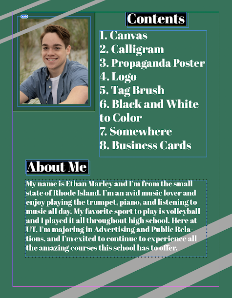
After becoming more comfortable working with InDesign, I was able to create a personalized portfolio containing all of the projects we've done throughout the semester. For reference, the first slide is above and the last slide ends with the business cards. This portfolio encompasses all of the hard work I've put in throughout this semester, and I couldn't be more proud of myself. Looking back on it, I didn't even realize how many projects we've actually done! I used a green color scheme, featuring a light green as the background with dark green, grey, and black as alternate colors. I can't wait to show this portfolio to my friends and family to show off all of my projects!




Comments

Popular posts from this blog

Vectors - Logo Project

  Hi Everyone! For my personal logo project I wanted to create something that was not only creative, but had multiple elements inside of it. Looking at some of my original sketches, I was sticking to things I knew and loved, for example, music, the trumpet, my favorite sport which is volleyball, and my Irish heritage. However, I thought about the deep connection I have to my home city of Providence, RI and decided to start there. My logo features an outline of the Providence skyline with my initials E and M between the buildings, as well as a clover in the middle symbolizing my heritage. Something about this logo felt special to me, as it encompasses a strong sense of home while also bringing in aspects of where my family originates from. I thought bringing a few of the buildings into the foreground would help my initials pop more and make them more noticeable. For my final 3 logo's I used some great brand color combos, featuring a red and black, as well as a baby blue and pastel g...

Tag Brush

  Artists Statement: Tag Brush was a very fun and creative assignment to work on. I was able to experiment with the various layers available to use and see what looked best with my logo. While complex, this assignment gave me great knowledge as to how to create a brush in Photoshop. Above is my basic B/W brush, and then to the left are my colorized ones. This brush worked great when adding my own personal touch to further assignments, almost like an artists signature. I'll definitely be using the skills I learned in this section for future projects and brush creations!

Business Cards

Artists Statement: This was my very first time working in InDesign and while its similar to other softwares we've used in class this semester, it also has its differences. My three logos features various different color schemes which I was able to coordinate with the business card colors. I feel as though business cards should be kept simple and not overcomplicated to keep focus on the logo and personal business information. On the front of the cards I included my logo and on some I included elements like diamonds and circles. On the back of the cards I included the same elements as the front but added in my business information. If I was to choose one card to actually use for a business I would choose the black and red color scheme because I think those colors go great together and looks the cleanest. Overall this project was super fun and allowed me to be very creative with my card designs!